Emotional Impact of Color in Film


Have you ever noticed how certain colors in a movie can make you feel a certain way? That’s no accident. Filmmakers and post-production pros use color psychology to evoke emotions and tell a more compelling story. Think about the last time a film really got to you emotionally. Chances are, the use of color played a big part in that. From the moody blues of a sad scene to the vibrant reds in a high-energy action sequence, color in film is a powerful tool to impact viewer emotions. It’s not just about making the scene look good; it’s about making the audience feel something.
Understanding Color Psychology in Film
Have you ever caught yourself feeling blue while watching a scene that’s, well, literally blue? That’s color psychology at work in film, a crafty tool in a director’s arsenal. Think about it – when you see a scene bathed in warm, golden hues, doesn’t it just fill you with a sense of nostalgia or warmth? Or how about those cold, grey tones that make you feel uneasy, like something’s not quite right? Directors and cinematographers aren’t just playing with colors to make the scene look good; they’re weaving an emotional tapestry that pulls us into the narrative. It’s like they’re using a color wheel to dial directly into our emotions, setting the tone for the story without saying a word.
And it’s not just about setting the mood; color psychology in film goes deeper, especially in character development. Ever noticed how the hero might have a specific color theme, signaling their journey or evolution? Or how the villain’s color scheme could give you the chills? This is no coincidence. In the world of post-production, where every detail counts, color choices can subtly guide the audience’s perception of a character. It’s a nuanced language, speaking volumes through shades and tints. As editors or post-production pros, we get to play a crucial part in this visual storytelling. We’re not just cutting and splicing footage; we’re helping to paint the emotional canvas of the film.
The Role of Colors in Evoking Specific Emotions
Colors speak a universal language of emotions. Take blue, for instance – it can convey sadness or tranquility, depending on the shade and context. Then there’s red, often used to signify passion, danger, or power. The emotional impact of these colors is something post-production wizards manipulate skillfully. They know just the right tint to add to provoke fear, excitement, or calm in the audience.
Case Studies: Color and Its Emotional Impact in Iconic Films
Let’s break down some iconic films and see how color played a role.
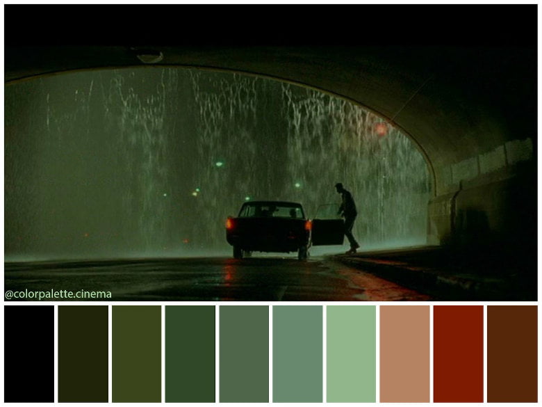
Remember the greenish tint in “The Matrix”? It gave the film a surreal, digital feel, perfectly matching its cyberpunk theme.
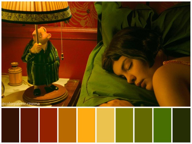
Or how about the vibrant, almost surreal colors in “Amélie”? They added to the whimsical, dream-like quality of the film. These aren’t just random choices; they’re deliberate decisions to evoke specific feelings and reactions.
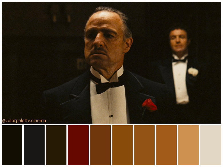
Take “The Godfather” for example. You can’t miss the use of shadows and low-key lighting, but it’s the color that really tells the tale. The deep, dark tones, splashes of cold grays and blacks, they all feed into that sense of dread and the morally ambiguous world of the Corleone family. It’s like each hue is a character in itself, whispering secrets about power, loyalty, and danger.
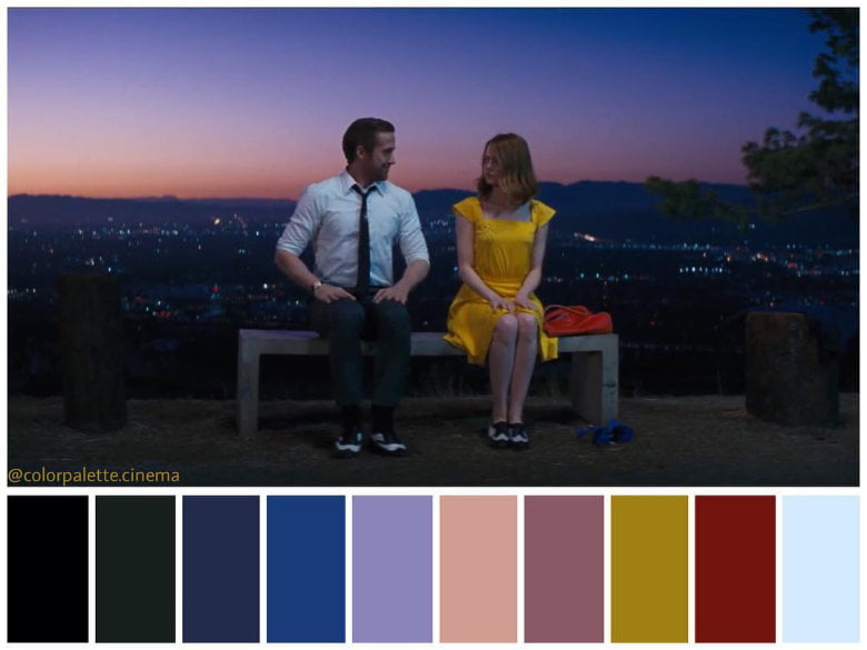
Then there’s “La La Land”, a total flip of the script. Here, the palette is all about amplifying emotions – the bright yellows, blues, and reds are practically dancing off the screen, mirroring the characters’ own dreams and aspirations. It’s a visual symphony that echoes the highs and lows of their journey, turning the city of Los Angeles into a canvas of hope, love, and at times, heartbreak. This isn’t just a choice, it’s a calculated move to connect us, the audience, on a deeper level with what’s unfolding on screen.
Practical Tips for Post-Production Color Choices
So, you’re in the post-production phase and wondering how to use color to your advantage? Start by understanding the story’s mood and themes. Is it a dark thriller? Muted, cool tones might work best. A light-hearted comedy? Go for bright, warm hues. Experiment with color grading software to find the perfect balance that enhances the film’s emotional resonance. And remember, subtlety is key. You want your audience to feel the impact of the colors without them screaming for attention.
Alright, let’s wrap this up! We’ve just taken a deep dive into how color in film isn’t just about aesthetics, it’s about stirring emotions. Whether you’re a seasoned editor or just starting to dabble in post-production, remember that color is a powerful tool in your storytelling arsenal. It’s not just about what the audience sees; it’s about what they feel. Next time you’re working on a project, think about the emotional journey you want your audience to take. With the right colors, you can make that journey unforgettable.
Interested in taking your color skills to the next level? If you’re intrigued by the art of color in film, why not explore the world of color grading? It’s one thing to understand the emotional impact of colors, but another to master the tools that bring those colors to life on screen. Dive into the nuances of color grading, where technology meets creativity, and learn how the right software can transform your post-production workflow.

Responses